Showing posts with label Analysis. Show all posts

Wednesday, 18 March 2015

Poster Analysis:Stone Sour

Stone Sours Posters:


Both of these poster advertise the release of their new album which I have annotated the digi-pak for. The album is simple yet gets the genre across very easily, you may not be able to pin point the exact genre but you can clearly tell it is not pop, but something much darker. This is due to the dark contrast and the images of a man on fire running and another of a man drowning. These are very dark and meaningful images and have been placed there to show suffering and darkness. Which is also shown with the flames appearing out the back of the Digi-Pak image
showing that it is dark and possibly having that evil connotation since flames are often a connotation of hell or evil.

The different band names allow everyone who look at the poster know bands similar to the ones bing advertised.The names of the other bands give a clear representation of the type of music which is being advertised, names such as Pop Evil and Stolen Babies does not show the typical connotation of pop, bu instead shoes something of a darker genre.


Wednesday, 10 December 2014

Album covers of grunge


Album Covers of Post Grunge


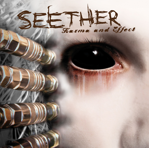
I am going to show all of the album covers of similar bands in order to get an overlook of the genre in general. I have looked at similar Digi-pak's and album covers, showing me what is involved within the genre of post-grunge. All of them are very simple but very effective and each almost tell the audience what the album is going to consist of and how deep into the genre of post grunge it really is.


All of these bands have a similar theme which is the low key lighting and vey obscure images used. Every image which has been used is very iconic and will be remembered which is what most artists want. All of the images which have been used are very dark and unusual which connotes the genre of post grunge. Non of them show any of the band members just things that not only represent the band but their profile in general. This shows me that you do not need to show the artists at any point within the digi-pak. 

Monday, 3 November 2014

Annotated Digi-Paks

Digi-Pak analysis

I have annotated a few digi-pak, which may be useful when creating my one. I have chosen one of a completely different genre and three of the same. The one of a different genre will help me and my group to see what elements that has and completely reverse them in order to get a less pop culture feel. The other three were similar genres and will help the group by making visible all of the elements, which work with the digi-pak and what do not in order to get a better finished piece.


Within these slides I have discussed everything, which is visible and will help the connotation of each digi-pak.

 This makes it a quick and simple task to look at all of my previous posts and pull bits of information and things which will work with the style and collaborate all of that information and get a finished product.

Sunday, 2 November 2014

Digi-pak verbal analysis (green screen)

For the green screen I have decided to talk about the digi-pak for Stone Sour. The album is called House of gold and bones Part 1.I have discussed the reasons why I have chosen this album and what things work well and could be incorporated within our piece.